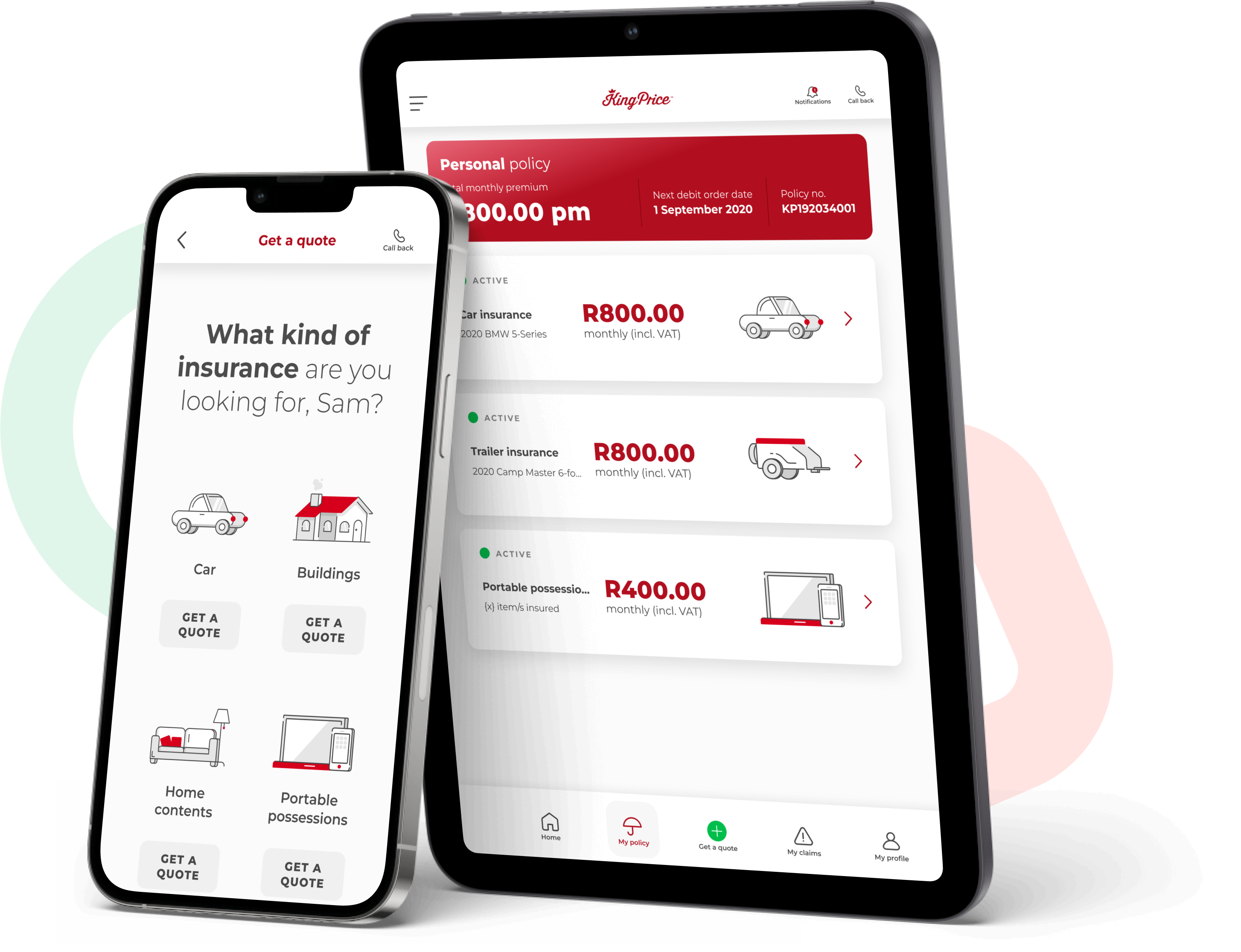
Download our
app
or register on our
self-service portal
Our app is kind of like your banking app, but for all your insurance needs! To get the King Price app, simply download it onto your phone. Or you can register on our self-service portal and access your profile via our website. Easy-peasy!
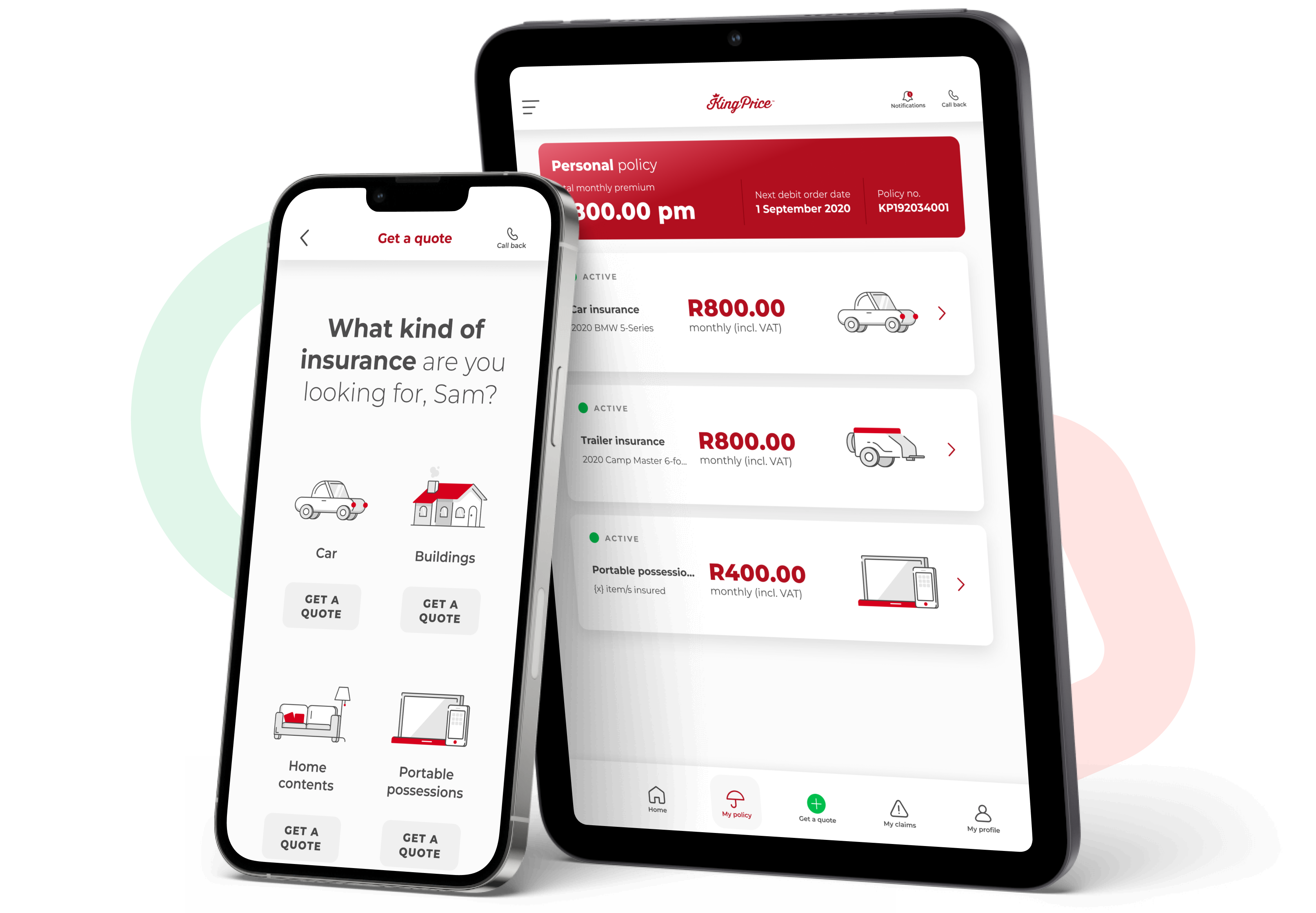
Download our
app
or register on our
self-service portal
Our app is kind of like your banking app, but for all your insurance needs! To get the King Price app, simply download it onto your phone. Or you can register on our self-service portal and access your profile via our website. Easy-peasy!


 Pretoria, Gauteng
 Closing date: 31 July 2025


